

The market close March 2 was not good. Perhaps the only faint glimmer of hope was that the S&P 500 index managed to hold above the important 700 level (though it barely held there). The Dow closed at 6763.29, making it feel like 1997 all over again.
The purpose of this post is to update our usual Dow 1900-2009 charts and our shorter-term arithmetic chart for 1997-2009. Our discussion of the market is coming, but what is haunting us right now is our post from back in November 2008:
Dow 4000?
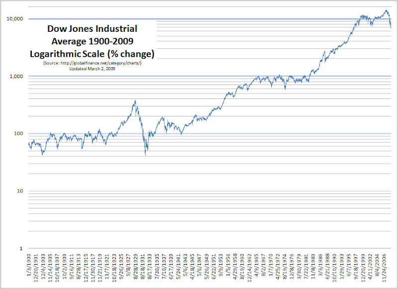
We need to look at the 1900-2008 chart to see the magnitude of the situation we are in. We will not attempt to discuss what got us here right now (debt, federal reserve, innovation, …), the fact is, we are here. Most of the large gain in the Dow is the 4000-14000 run from 1995 to 2007.
Only two more years backward to go before we reach 1995. One other observation with today’s charts is that the bull-runs of 1999-2002 and 2005-2008 appear to form a double top at the very peak of a much larger wave. In technical analysis (and I don’t put that much weight in technical analysis), this is a sign that things are about to fall.
(More on the Dow’s decline, the double-top and the charts after the jump…)
Double top visible for the decade of 1999-2008
A double-top pattern can be seen in the 1900-2009 chart from 1999-2008. This double-top forms at the end of a bull run that got its start right after the 1987 market crash (the ‘87 crash is barely visible on the chart):
The arithmetic chart of 1997-2009 shows the damage report for the day:

Perhaps the market will decide it has seen enough.
. . . And that’s how it goes

