

The news media has been pushing an attack on the Obama administration connecting the severe decline in the markets. Barry Ritholtz covers the alleged paid revolt started by Rick Santelli at CNBC, but the negative coverage from the MSM begs a larger question – does Obama need to start worrying about the markets?
In short, any political consultant getting a daily poll for the President would probably advise a gradualist course of action. The reason is Mr. Obama’s high approval ratings and low disapproval numbers. As to the opposition, well, the Republicans have proven themselves good at self-destruction.
But those approval/disapproval metrics may be changing is a way that should worry the pols in Washington, and there is a clear correlation with the Dow Jones.
(Charts and discussion after the jump…)
Bad times cause deep division
We plotted a chart of Obama’s approval and disapproval number since the election on November 20 alongside the Dow Jones. the chart is below with some discussion:
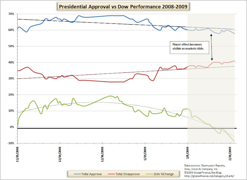
Our chart data comes from Rasmussen polling data conducted since November 20. We have edited the data points so that the poll and the Dow match day by day (polls were taken on some days the market was closed and the polls took a holiday on some trading days). Also, we should caution that each pollster has political biases, in this case Rasmussen is conservative, but the data would be useful to a Democratic White House interested in keeping away political problems. Finally, keep in mind that this is just a simple graph, correlation does not imply causation!
What is apparent from the chart is that as the Dow sinks and develops a down-trend, Obama’s poll number become subject to a pincer effect. That is, we see the red state vs blue state phenomenon crop up again. A majority of those polled still support Obama, but opposition starts to rise. This may not seem critical if one looks only at approval numbers, but it becomes important if that approval number drops in to the 50% range, having a large, vocal opposition in a time of crisis is not a good thing. Unfortunately, that is the picture that is forming on the chart.
Update to historical performance vs FDR, Reagan and Clinton
The four presidents chart is also starting to look bad. While we noted that FDR started with a market downturn (and obviously very, very severe economic problems), his quick action managed to turn the markets and result in a large gain for his first year as President. Here is the chart as it stands now:
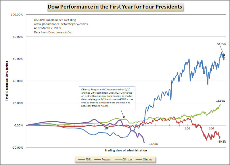
Obama has also started with a downturn, but it will take immediate action and more work to get his numbers to be competitive with FDR. Not impossible, but difficult. I think I am with Paul Krugman on this one, each 2-4% down day on the market, I get more and more in to despair.
(Presidential photo from whitehouse.gov)
Update: More on the Santelli affair at Barry Ritholtz’ blog The Big Picture.
. . . And that’s how it goes

