Many financial advisors suffer from detachment from reality syndrome. They believe in propaganda dictated by their firms like “markets always go up in the long term.” Ha, right, try saying that on the streets of Reykjavik. If you consider the long term to be 50 or more years, then the proposition is correct, sometimes (it doesn’t work in places like pre-Communist Russia or China where markets were closed for decades).
Charts to Bring Your Broker Back to Reality
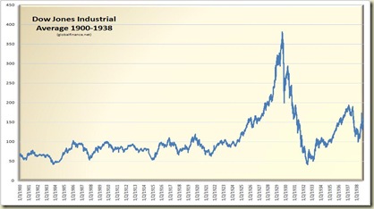
If we look at the Dow Jones Average of 30 Industrial Stocks starting in 1900, we see how market movements seem to obliterate the oft-regurgitated “buy and hold” mantra of every retail broker. First, lets look at the market from 1900-1938:
We see that the period from 1900 to 1924 was generally a cycle of peaks and troughs, not one of sustained growth. For instance, buying the Dow on 1/3/1900 at 66.61 and selling on 1/3/1923 at 99.42 right before the run that would lead to the 1929 bubble, you would have gotten a 2.14% annual return on your investment. Of course whomever bought on 1/3/1923 at 99.42, held during the 1929 crash and sold ten years later on 1/3/1933 at 59.29 got a –4.03% annual return. Imagine the problems of a 32 year old professional in 1900 who was told by her broker to buy the Dow and hold on to retirement until age 65. She would hot have lost it all, but her principal would be off by –10.99% and, of course, no capital appreciation. So, markets do not always go up!
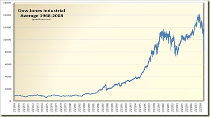
Our next chart is an illustration to show how the past few decades are similar to the 1900-1940s era. Below is a chart of the Dow from 1968-2008.
On the 1968-2008 chart we see a similar cyclicality up to 1987, then a clear uptrend. This is probably when stockbrokers thought that the old rules of gravity ceased to apply and markets would only go up. Between 2000-2003, the market started to correct in a pattern similar to 1929, but the efforts of Alan “Bubbles” Greenspan and massive tax cuts managed to reflate the economy and drive the market to a peak towards the end of 2007. The next chart will show just how scary the belief in markets always go up really is . . .
Dow 4000?
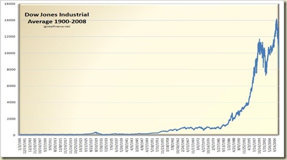
We need to look at the 1900-2008 chart to see the magnitude of the situation we are in. We will not attempt to discuss what got us here right now (debt, federal reserve, innovation, …), the fact is, we are here. Most of the large gain in the Dow is the 4000-14000 run from 1995 to 2007.
Update: See the post Dow Jones 1900-2008 Chart (Update) for a recent update and better chart
Update 2: Please see the latest charts as of December 1, 2008 in the post titles Dow Jones 1900-2008 Charts (More Updates). The update includes both logarithmic and arithmetic charts of the Dow to date.
We see here that the stock bubble is deflating like the bubble during 1929 and many of the cycles that occurred during the market since 1900. To repeat, markets don’t always go up! Here is the scary part, our logical conclusion is that the chart pattern shows a drop to early 1990s levels of 2000-4000 on the Dow, a 50-75% slide from current levels.
Conclusion
None of this is certain and my experience in finance has been that charts are helpful but they are not everything. It is more important to monitor economic policy and corporate fundamentals as those play a much greater role in determining market prices. But, the charts are giving us a warning and it is that markets don’t go up all the time – even in the long term!
. . . And that’s how it goes


