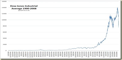
Update: Please see the latest charts as of December 1, 2008 in the post titles Dow Jones 1900-2008 Charts (More Updates). The update includes both logarithmic and arithmetic charts of the Dow to date.
This is the latest update of the chart I’ve put together that shows the Dow Jones Industrial Average (DJIA) from 1900-2008. The chart is very simple, without the fancy graphics, but shows the rise in prices from the 1990s to today (as well as the unwind we are going through now). This chart starts January 3, 1900 and is updated through the market close November 21, 2008.
The post Charts To Show That Markets Don’t Always Go Up has the original chart, plus some snapshot charts from times along the 1900-2008 continuum to illustrate how market cycles work.
Things to Think About for Monday
- The market closed above 8,000. This is a good sign. Perhaps we have bottomed, perhaps not, but the close at this level appears to be because of two pieces of good news: Obama’s pick of Tim Geithner for Treasury and that the Democrats (or the Chinese) will not let the bit 3 automakers nor Citibank sink to oblivion.
- Is 8,000 really a technical bottom where we go up from here or a short-term stop while we continue a debt-driven unwind on our way lower?
- The Dow is not the best indicator of market performance since most investors don’t buy the Dow itself (the Dow does not account for dividends, for instance). What would be a better indicator of market performance?
What to really think about over the weekend is enjoying the weather, fun, family, friends, anything but global finance. We’re back to work Monday morning (and for a short week in the U.S.).
. . . And that’s how it goes


